Portfolio
Modulo: The Modular Furniture Store
A TripleTen project to build an ecommerce website focusing on sustainable furniture.
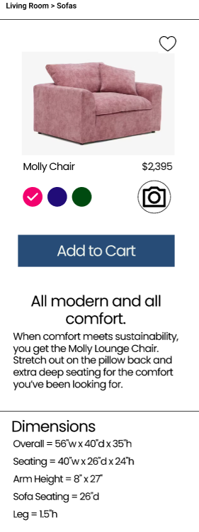
On my final project for TripleTen, I had a chance to build an ecommerce site, specifically a furniture retail site. As I was researching and interviewing consumers, I found that they have the same wants and needs when purchasing furniture. “How will this look in my space?” “Will this color clash with my flooring?”
Customers didn’t trust the quality of the material when shopping online. They wanted the ability to see and touch the fabric as well as the ability to see these items in their own space. Customers also needed tools to plan and design their own spaces.
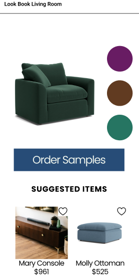
To build up the customers’ confidence in their purchases, there were three main features that were included in the site and app. I gave customers the ability to order samples, to save items in a look book to help create a cohesive look with color and item suggestions, and added a AR camera button to view each item in their own space.
While I consider the design to be a success, I do believe that there are areas that need to be improved. If given more time to refine, I would like to have the look book include items within the visual and not just the ‘Suggested Item’ category. During testing, users have mentioned that they would like to see the dimensions on the item itself, not listed in the specs.
Amazon Prime: User Research
For my second project with Triple Ten, I conducted user research on the use of Amazon Prime. We all know about Amazon. Most of us have purchased item from Amazon. However, I noticed that Amazon Prime is not often talked about among my friends or family.
I interviewed three people focusing on their experience with the Amazon Prime streaming service. Each person that was interviewed thought that the content in Amazon was disorganized and jumbled. Other insights included lack of suggested content related to what they have watched previously and confusion over what content was included in their membership and what was content required additional costs.
2nd Treasure: IOS Market Place App
On this specific project, I researched marketplace apps and studied Apple’s HIG. Through my research, the key components I wanted to include were the ability to message sellers and add items as a favorite.
‘2nd Treasure’ is derived from the phrase ‘One man’s trash is another man’s treasure.’ I kept the design mostly white with green buttons to represent trust.
Good Food Blog
This was one of my favorite projects. As a food lover who frequents many food blogs, I got create one for my sixth project with Triple ten.
To increase engagement, I used neutral colors and yellows to stimulate appetite. I kept the colors warm to reflect the comfort food displayed on the main page, while keeping the font fun and playful, because who doesn’t enjoy food?
To-Dos: A Competitive Analysis
We all have things to and get done. With our busy lives there are many apps to help organize our tasks. For the fifth project with Triple Ten, I was tasked to design a task app.
I had downloaded three other task apps to experience how they work and organize each task. Based on my experience and reading the experiences of other users, the key components I wanted to include was the ability to organize each task into a category and mark them at different levels of priority.
Spooky Misfits: Buy Tickets if You Dare
I’ll admit that I didn’t want spooky season, or autumn to end. When being task to create a brand and an app, of course I kept the spooky theme going.
Spooky Misfits is an event app that show cases spooky and Halloween themed shows, tours, and meet ups. Using the warm colors of autumn kept the app inviting.